I'm trying to run the DBSCAN algorithm on this .csv. In the first part of my program I load it and plot the data inside it to check its distribution. This is the first part of the code:
import csv
import sys
import os
from os.path import join
from sklearn.cluster import DBSCAN
import matplotlib.pyplot as plt
import numpy as np
def load_data(file_path, file_name):
   with open(join(file_path, file_name)) as csv_file:
       data_file = csv.reader(csv_file,delimiter=',')
       temp1 = next(data_file)
       n_samples = int(temp1[0])
       print("n_samples=")
       print(n_samples)
       n_features = int(temp1[1])
       temp2 = next(data_file)
       feature_names = np.array(temp2[:n_features])
   data_list = [iter for iter in data_file]

   data = np.asarray(data_list, dtype=np.float64)


return(data,feature_names,n_samples,n_features)
--- Main program ---
file_path="Datasets/"

file_name3="CURE-complete.csv"

data3,feature_names3,n_samples3,n_features3 = load_data(file_path, file_name3)
fig = plt.figure(figsize=(8,8))
ax = fig.add_subplot(111)
fig.subplots_adjust(top=1)
ax.set_title('Dataset n. 3 of data points')
ax.set_xlabel(feature_names3[0])
ax.set_ylabel(feature_names3[1])
plt.plot(data3[:,0], data3[:,1], '.', markersize=1.2, markeredgecolor = 'blue')
plt.show()
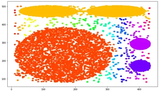
This is how the data are in represented:

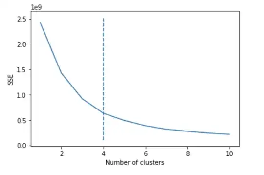
Since I need to know how many clusters should I split the dataset into, I used the Means algorithm which returned 4 (this is the elbow of the diagram, the best value):
sse = {}
for k in range(1, 11):
    kmeans = KMeans(n_clusters=k, random_state=0).fit(data3)
    sse[k] = kmeans.inertia_
kn = KneeLocator(
    list(sse.keys()),
    list(sse.values()),
    curve='convex',
    direction='decreasing',
    interp_method='polynomial',
)
plt.figure()
plt.plot(list(sse.keys()), list(sse.values()))
plt.vlines(kn.knee, plt.ylim()[0], plt.ylim()[1], linestyles='dashed')
plt.xlabel("Number of clusters")
plt.ylabel("SSE")
plt.show()
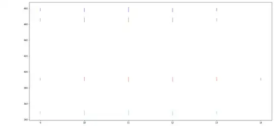
Then, I run the DBSCAN algorithm with the following parameter: min_sample = 10 (fixed value, I need to use it) and eps = 2. This is the code:
np.random.seed(5)
dbscan2 = DBSCAN(eps=2, min_samples=10).fit(data3)
fig = plt.figure(figsize=(20,10))
ax = fig.add_subplot(111)
fig.subplots_adjust(top=1)
ax.set_title('Clustered points in dataset n. 3')
ax.set_xlabel('x')
ax.set_ylabel('y')
set the list of colors to be selected when plotting the different clusters
color=['b','g','r','c','m','y','k','w']
number of clusters given by the diagram
k=4
#plot the dataset
for clu in range(k):
    # collect the sequence of cooordinates of the points in each given cluster (determined by clu)
    data_list_x = [data3[i,0] for i in range(n_samples3) if dbscan2.labels_[i]==clu]
    data_list_y = [data3[i,1] for i in range(n_samples3) if dbscan2.labels_[i]==clu]
    plt.scatter(data_list_x, data_list_y, s=10, edgecolors='none', c=color[clu], alpha=0.5)
plt.show()
Is my process incorrect? I do not understand why the plots looks so different. I would expect a digram like to the first one but with different color for each cluster.


