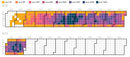
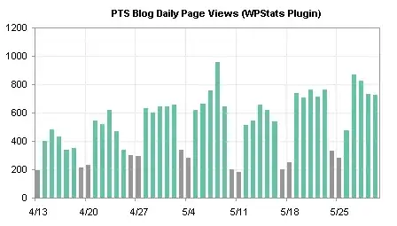
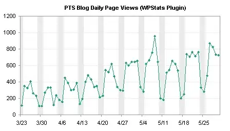
I am currently using the heat map below to communicate the number of messages sent on a messing platform over time. I don't think this is the most effective way to communicate the information as it's difficult to read and see trends. Although, I really like the ability to compare by week day (most of the messages are not send on weekends and I'd like to communicate this). What is a good alternative to heat maps that maintain the ability to communicate the weekday? Thanks for your help!
Asked
Active
Viewed 1,021 times


