18

I have a data set of time series data. I'm looking for an annotation (or labeling) tool to visualize it and to be able to interactively add labels on it, in order to get annotated data that I can use for supervised ML.

E.g. the input data is a csv-file and the output is another csv-file of the format timestamp,label.

Therefore I need something like this:

  1. to visualize data
  2. to select a specific area
  3. output the labels with timestamps

As an example:

An example

Building such a tool in python will not take too long, however I was just wondering how other people solve this problem and maybe there are already nice OS tools for doing this. Thank you!
mibrl12
  • 283
  • 1
  • 2
  • 5

7 Answers7

15

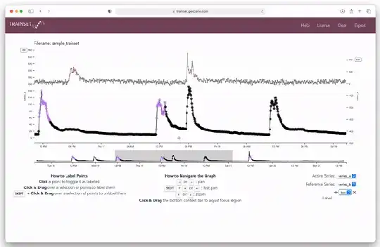
Update: we have updated TRAINSET to include the ability to upload multiple series as well as apply multiple labels! See demo in GIF below.

We had this same problem again and again at Geocene, so we came up with this open-source web app called TRAINSET. You can use TRAINSET to brush labels onto time series data. You import data in a defined CSV format, then label the data, and export a labeled CSV. You can also import a pre-labeled CSV if you're really just trying to refine labels. You can use the hosted version of TRAINSET at https://trainset.geocene.com or you can deploy it yourself by following the readme at https://github.com/geocene/trainset

![Brushing and labeling time series data with TRAINSET to create a training set for machine learning.

daterdots
  • 166
  • 1
  • 4
5

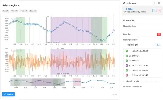
A little bit too late to the party but it's better than never. We've released a major version update to our time-series data labeling tool called Label Studio.

Now it supports a variable number of channels with millions of data points in each, with zoom/pan, region labeling, and instance (single event) labeling.

It works with different time-series data types, for example, time may come as a float or as a strangely formatted date, has multi-user support, and multi-label classification.

time-series data labeling

Please visit https://heartex.ai for the commercial version and https://labelstud.io/ for the open-source (right now needs some hand compiling)

4

I am currently developing a set of tools to annotate and detect patterns in time series data: https://github.com/avenix/WDK

check the AnnotationApp in 1-Annotation

3

I also need such a tool to annotate data but did not found any suitable tool. Therefore, i wrote a small python app by myself, just abused matplotlib for this task.

I used matplotlib.use('TkAgg') and SpanSelector with my own onselect(xmin, xmax) method called for this task. Check this code example: https://matplotlib.org/gallery/widgets/span_selector.html

2

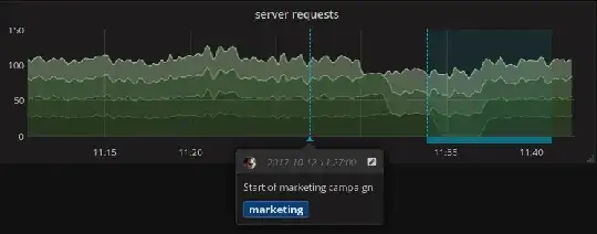
There is an open source platform for visualization called Grafana, that is a very powerful and flexible software used also for monitoring time series. They support annotation.

Grafana screenshoot for annotation functionality

That tool is pretty powerful and versatile, you can read data from a variety of data sources.

Then once annotated as in the picture, you can query the Grafana annotation database to retrieve all the annotations/labels that you put thanks to the Grafana annotation API.

Bonus tip 1: you can add customised tags on your annotation so that you can get additional info on your data (e.g. anomaly_A, anomaly_B, flat_normal_data).

Bonus tip 2: you can also show only one specific kind of anomaly still in the same platform thanks to this functionality.

Future improvements: extension to this powerful features are in discussion, so that it will be even more easy to annotate in presence of diagrams displaying multiple time series at ones (e.g. anomaly of many time series).

Applications: anomaly detection labelling, medical signal annotation, stock market annotation, etc.

ebrahimi
  • 1,305
  • 7
  • 20
  • 40
1

Nova can do it interactively. https://github.com/hcmlab/nova It's much more powerful than just labeling time-series data, but you can just do labeling with it. Also, I suggest you set the sample rate frequency to 1Hz. Best of Luck.

drerD
  • 111
  • 1
0

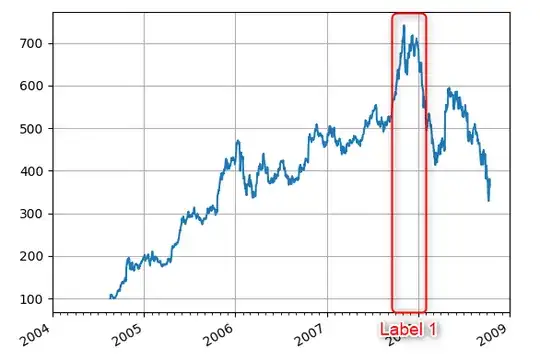
I'm using axvspan() function from matplotlib.pyplot. Main disadvantage is a difficult configuration of text labels.

import matplotlib.pyplot as plt
import numpy as np
t = np.arange(0,3.14,0.01)
s = np.sin(t)
plt.axvspan(t[12], t[100], facecolor='blue', alpha=0.2)
plt.plot(t,s,color='red')
Rolan
  • 1
  • 1