What tools can I use to make a visualization similar to this one? I want to have the mean be bolded and the standard deviation be shaded.

What tools can I use to make a visualization similar to this one? I want to have the mean be bolded and the standard deviation be shaded.
The below piece of code will generate the following Image(your's is Subplotting Three of them, so you will get 3 different axe's and per axes you have to use fill-between) (Kindly ignore the Axis Label's..)
plt.style.use('ggplot') #Change/Remove This If you Want

fig, ax = plt.subplots(figsize=(8, 4))
ax.plot(trees_grid, train_acc.mean(axis=1), alpha=0.5, color='blue', label='train', linewidth = 4.0)
ax.plot(trees_grid, test_acc.mean(axis=1), alpha=0.5, color='red', label='cv', linewidth = 1.0)
ax.fill_between(trees_grid, test_acc.mean(axis=1) - test_acc.std(axis=1), test_acc.mean(axis=1) + test_acc.std(axis=1), color='#888888', alpha=0.4)
ax.fill_between(trees_grid, test_acc.mean(axis=1) - 2*test_acc.std(axis=1), test_acc.mean(axis=1) + 2*test_acc.std(axis=1), color='#888888', alpha=0.2)
ax.legend(loc='best')
ax.set_ylim([0.88,1.02])
ax.set_ylabel("Accuracy")
ax.set_xlabel("N_estimators")

Use the seaborn plotting library for python, specifically seaborn.tsplot:
import seaborn as sns

gammas = sns.load_dataset("gammas")
ax = sns.tsplot(time="timepoint", value="BOLD signal",
                 unit="subject", condition="ROI",
                 data=gammas)
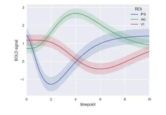
Note: tsplot() is deprecated as of seaborn version 0.9. It thus might be good to use some other way to plot the data.