7

I have a vector and want to detect outliers in it.

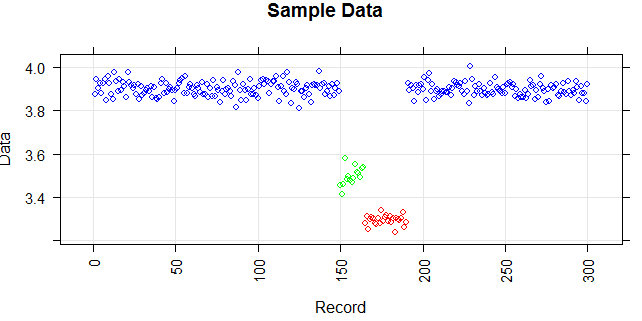
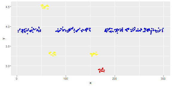
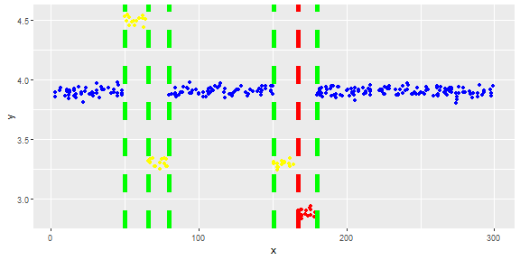
The following figure shows the distribution of the vector. Red points are outliers. Blue points are normal points. Yellow points are also normal.

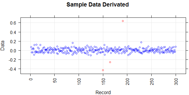
I need an outlier detection method (a non-parametric method) which can just detect red points as outliers. I tested some methods like IQR, standard deviation but they detect yellow points as outliers too.

I know it is hard to detect just the red point but I think there should be a way (even combination of methods) to solve this problem.

enter image description here

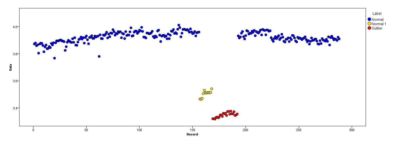
Points are readings of a sensor for a day. But the values of the sensor change because of system reconfiguration (the environment is not static). The times of the reconfigurations are unknown. Blue points are for the period before reconfiguration. Yellow points are for after the reconfiguration which causes deviation in the distribution of the readings (but are normal). Red points are results of illegal modifying of the yellow points. In other words, they are anomalies which should be detected.

I'm wondering whether the Kernel smoothing function estimate ('pdf','survivor','cdf',etc.) could help or not. Would anyone help about their main functionality (or other smoothing methods) and justification to use in a context for solving a problem?

Stephen Rauch
  • 1,831
  • 11
  • 23
  • 34
Arkan
  • 453
  • 4
  • 13

3 Answers3

4

You may view your data as a time series where an ordinary measurement produce a value very close to the previous value and a re-calibration produce a value with a large difference to the predecessor.

Here are simulated sample data based on normal distribution with three different means similar to your example. enter image description here

By calculating the difference to the previous value (a sort of derivation) you get the following data:

enter image description here

My interpretation of your description is, that you tolerates re-calibration (i.e. points on greater distance from zero, red in the diagram), but they must interchange between positive and negative values (i.e. corresponding to shift from blue state to the yellow one and back).

This means you can set up an alarm seeing a second one red point either on the negative or positive side.

Marmite Bomber
  • 1,113
  • 1
  • 8
  • 11
0

If you use logging you can use a running average that resets if the configuration changes. However, this will have the weakness that you need at least some data before you can detect such an outlier.

Your data looks rather "nice" (not too much noise). I would recommend taking the average over the last 10-20 points in the same configuration. If these values are some kind of counted quantity you can take a poisson error for individual data points and calculate the error on the average.

How much historical data do you have? If you have a lot you can use it to fine tune your alarm rate in a way that you catch an acceptable ratio of all real outliers while getting a minimal number of fake warnings. What is acceptable depends on the specific problem. (Cost of False Positives or not detected outliers and their abundance).

El Burro
  • 800
  • 1
  • 4
  • 12
0

Lets illustrate the approach proposed in the other answer with an simple example

Get Data

We will simulate tha data with seven chunks produced with normal distribution with different means.

This is important as it allow us to cleanly distinct between the groups and to simple detect the breaking points. This answer use elementary threshold approach, some more advanced way might be required for your real data.

dt <- rbind(
data.frame(color=1, x =  round(runif(50, min = 0, max = 50)), y = rnorm (50,mean=3.9, sd=.03)), 
data.frame(color=2, x =  round(runif(15, min = 50, max = 65)), y = rnorm (15,mean=4.5, sd=.03)),
data.frame(color=2, x =  round(runif(15, min = 65, max = 80)), y = rnorm (15,mean=3.3, sd=.03)),
data.frame(color=1, x =  round(runif(70, min = 80, max = 150)), y = rnorm (70,mean=3.9, sd=.03)), 
data.frame(color=2, x =  round(runif(15, min = 150, max = 165)), y = rnorm (15,mean=3.3, sd=.03)), 
data.frame(color=3, x =  round(runif(15, min = 165, max = 180)), y = rnorm (15,mean=2.9, sd=.03)), 
data.frame(color=1, x =  round(runif(120, min = 180, max = 300)), y = rnorm (120,mean=3.9, sd=.03))
)
dt$color <- as.factor(dt$color)
dt <- as_tibble(dt)

enter image description here

Derive the Breaking Points

With a simple difference to the preceeding point lag(y) we get the outliers. They are classsified using a threshold.

enter image description here

Change of Behaviour Classification

Base on the rules you described, the breaking points are classified as OK and problem.

The rule states that no two changes in the same direction are allowed. The second move in teh previos direction is considered as a problem.

You may need to adjust this simple interpretation if your logik is more advanced.

## extract outliers and get previous value
dt2 <- filter(dt2, diff != 0) %>%
   mutate(cs = cumsum(diff),
          prev = lag(diff),
          cls = case_when(
                      diff * prev >  0 ~ "problem",
                      TRUE ~ "OK"))
## show 
dt2 %>% select(x,y,diff,prev,cls)                       
## # A tibble: 6 x 5
##       x     y  diff  prev cls    
##   <dbl> <dbl> <dbl> <dbl> <chr>  
## 1    50  4.53     1    NA OK     
## 2    66  3.32    -1     1 OK     
## 3    80  3.87     1    -1 OK     
## 4   151  3.32    -1     1 OK     
## 5   167  2.91    -1    -1 problem
## 6   180  3.87     1    -1 OK

Presentation

Finaly you projects the recognised outliers to the original data

## project in the original data
ggplot(data=dt, mapping = aes(x=x, y=y) )  +
  geom_point(mapping = aes(color = color) )  +
  scale_color_manual(values=c("blue", "yellow", "red","green","red")) +
  theme(legend.position="none") +
  geom_vline(data=dt2, aes(xintercept=x, color=cls),
             linetype="dashed", size = 2)

enter image description here

Marmite Bomber
  • 1,113
  • 1
  • 8
  • 11