1

I know that left and right skewness means it has a long tail on either the left(left skewness) or right(right skewness).

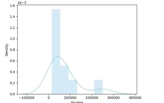
However, the example below is an example of right skewness.

data = pd.DataFrame({
  "Income": [15000, 22000, 30000, 35000, 42000, 50000, 65000, 78000, 120000, 250000]
})
sns.distplot( data['Income'] , color="skyblue", label="Sepal Length")

enter image description here

Now my understanding of right skewness is fewer data points on the increasing value of the x-axis. So is my understanding correct? and how do I fix this chart to be a normal distribution?

AFAIK, using central limit theorem I should be able to convert any shape to standard normal distribution but it requires a minimum sample size of 30. So in my case is there any other way or adding more data points is the only way?
RushHour
  • 145
  • 6

1 Answers1

2

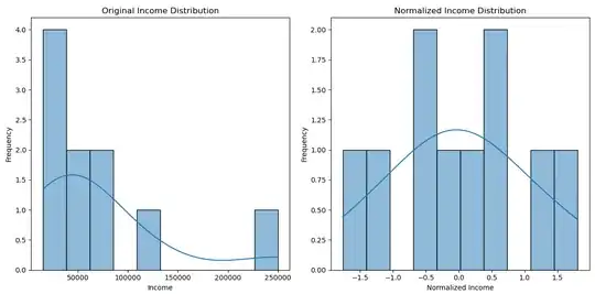
You can transform your data to achieve a more normal distribution using the Yeo-Johnson Power Transformer, which also scales the data effectively. Here’s the code to implement it:

import pandas as pd  
from sklearn.preprocessing import PowerTransformer  
import matplotlib.pyplot as plt 
import seaborn as sns

data = pd.DataFrame({ "Income": [15000, 22000, 30000, 35000, 42000, 50000, 65000, 78000, 120000, 250000] })

Apply Yeo-Johnson Power Transformation to the "Income" data

data["Income_Normalized"] = PowerTransformer(method='yeo-johnson').fit_transform(data[["Income"]])

Plotting the distributions

plt.figure(figsize=(12, 6)) for i, col in enumerate(["Income", "Income_Normalized"], 1): plt.subplot(1, 2, i) sns.histplot(data[col], bins=10, kde=True) plt.title(f'{"Normalized" if col == "Income_Normalized" else "Original"} Income Distribution') plt.xlabel('Income' if col == "Income" else 'Normalized Income') plt.ylabel('Frequency')

plt.tight_layout() plt.show()

Here are the graphs showing the original and normalized income distributions: enter image description here

Gizem
  • 54
  • 5