3

I'm trying to plot a 3d antenna radiation pattern using python (or js if possible) but my code is not working. Here is what my dataset looks like:

Theta [deg.]  Phi   [deg.]  Abs(RCS )[dB(m^2)]   Abs(Theta)[dB(m^2)]  Phase(Theta)[deg.]  Abs(Phi  )[dB(m^2)]  Phase(Phi  )[deg.]  Ax.Ratio[dB    ]    
---------------------------------------------------------------------------------------------------------------------------------------------------------
 175.000           2.500           -4.083e+01          -4.117e+01             118.796          -5.208e+01             120.015           4.000e+01     
 177.500           2.500           -4.005e+01          -4.018e+01             118.327          -5.539e+01             117.213           4.000e+01     
 180.000           2.500           -4.054e+01          -4.055e+01             119.035          -6.585e+01             103.657           3.685e+01     
   0.000           5.000           -4.039e+01          -4.043e+01              52.496          -6.111e+01             247.581           3.244e+01     
   2.500           5.000           -4.028e+01          -4.039e+01              51.026          -5.616e+01             277.199           1.871e+01     
   5.000           5.000           -4.011e+01          -4.040e+01              52.497          -5.194e+01             295.813           1.265e+01     
   7.500           5.000           -4.016e+01          -4.043e+01              50.019          -5.247e+01             298.975           1.271e+01     
  10.000           5.000           -4.000e+01          -4.036e+01              50.000          -5.101e+01             306.994           1.091e+01     
  12.500           5.000           -4.026e+01          -4.064e+01              52.824          -5.102e+01             311.570           1.059e+01

Here are my functions for converting spherical to cartesian and vice-versa:

import math
import pandas as pd
import numpy as np
import plotly.graph_objects as go

def spherical_to_cartesian(theta, phi, rcs): x = rcs * math.cos(phi) * math.sin(theta) y = rcs * math.sin(phi) * math.sin(theta) z = rcs * math.cos(theta) return x, y, z

def get_transformed_dataframe(path): df = pd.read_csv(path, sep="\s+", skiprows=2, header=None) df.columns = ['theta', 'phi', 'rcs', 'abs(theta)', 'phase(theta)', 'abs(phi)', 'phase(phi)', 'ax.ratio'] result_df = df.apply(lambda x: spherical_to_cartesian(x.theta, x.phi, x.rcs), axis=1, result_type='expand') result_df.columns = ['x', 'y', 'z'] result = df.join(result_df) return result

df = get_transformed_dataframe('test.txt') x, y, z = df.x, df.y, df.z fig = go.Figure(data=[go.Surface(z=z, x=x, y=y)]) fig.update_layout(title='test') fig.show()

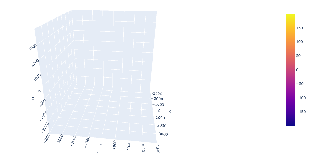
This is my output, which shows nothing: Plotted output

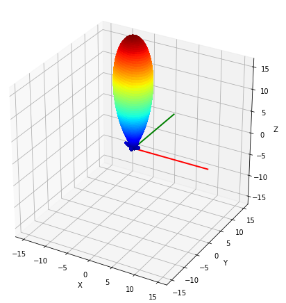
And this is the kind of output I'm trying to get:

Desired output

Any idea what is wrong with my code, and how can I get closer to my desired output?

Farzin
  • 141
  • 2
  • 5

1 Answers1

3

Today I wanted to do the same thing and met the same problem. I guess your data was obtained from CST Studio Suite like a farfield.

After some observations I found a good solution. Actually, I used mounting to Google Drive, but it is easy to switch to another data source. Below there is a full code, which provides you with the exact result:

import numpy as np
import matplotlib.pyplot as plt
import mpl_toolkits.mplot3d.axes3d as Axes3D
from numpy import sin,cos,pi, exp,log
from tqdm import tqdm
# import mpl_toolkits.mplot3d.axes3d as Axes3D
from matplotlib import cm, colors

filepath = 'Data_From_CST.txt'

vals_theta = [] vals_phi = [] vals_r = [] with open(filepath) as f: for s in f.readlines()[2:]: vals_theta.append(float(s.strip().split()[0])) vals_phi.append(float(s.strip().split()[1])) vals_r.append(float(s.strip().split()[2]))

theta1d = vals_theta theta = np.array(theta1d)/180*pi;

phi1d = vals_phi phi = np.array(phi1d)/180*pi;

power1d = vals_r power = np.array(power1d);

power = power-min(power)

power = 10**(power/10) # I used linscale

X = powersin(phi)sin(theta) Y = powercos(phi)sin(theta) Z = power*cos(theta)

X = X.reshape([360,181]) Y = Y.reshape([360,181]) Z = Z.reshape([360,181])

def interp_array(N1): # add interpolated rows and columns to array N2 = np.empty([int(N1.shape[0]), int(2N1.shape[1] - 1)]) # insert interpolated columns N2[:, 0] = N1[:, 0] # original column for k in range(N1.shape[1] - 1): # loop through columns N2[:, 2k+1] = np.mean(N1[:, [k, k + 1]], axis=1) # interpolated column N2[:, 2*k+2] = N1[:, k+1] # original column N3 = np.empty([int(2N2.shape[0]-1), int(N2.shape[1])]) # insert interpolated columns N3[0] = N2[0] # original row for k in range(N2.shape[0] - 1): # loop through rows N3[2k+1] = np.mean(N2[[k, k + 1]], axis=0) # interpolated row N3[2*k+2] = N2[k+1] # original row return N3

interp_factor=1

for counter in range(interp_factor): # Interpolate between points to increase number of faces X = interp_array(X) Y = interp_array(Y) Z = interp_array(Z)

N = np.sqrt(X2 + Y2 + Z**2) Rmax = np.max(N) N = N/Rmax

fig = plt.figure(figsize=(10,8))

ax = fig.add_subplot(1,1,1, projection='3d') axes_length = 0.65 ax.plot([0, axes_length*Rmax], [0, 0], [0, 0], linewidth=2, color='red') ax.plot([0, 0], [0, axes_length*Rmax], [0, 0], linewidth=2, color='green') ax.plot([0, 0], [0, 0], [0, axes_length*Rmax], linewidth=2, color='blue')

Find middle points between values for face colours

N = interp_array(N)[1::2,1::2]

mycol = cm.jet(N)

surf = ax.plot_surface(X, Y, Z, rstride=1, cstride=1, facecolors=mycol, linewidth=0.5, antialiased=True, shade=False) # , alpha=0.5, zorder = 0.5)

ax.set_xlim([-axes_lengthRmax, axes_lengthRmax]) ax.set_ylim([-axes_lengthRmax, axes_lengthRmax]) ax.set_zlim([-axes_lengthRmax, axes_lengthRmax])

m = cm.ScalarMappable(cmap=cm.jet) m.set_array(power) ax.set_xlabel('X') ax.set_ylabel('Y') ax.set_zlabel('Z')

fig.colorbar(m, shrink=0.8) ax.view_init(azim=300, elev=30)

plt.show()

Output img.

As you can easily see, this code expects three data arrays: two Euler's angles and a function you want to plot.

In my studies I used these two useful sources:

  1. https://stackoverflow.com/questions/54822873/python-plotting-antenna-radiation-pattern;
  2. https://stackoverflow.com/a/63059296.