all,
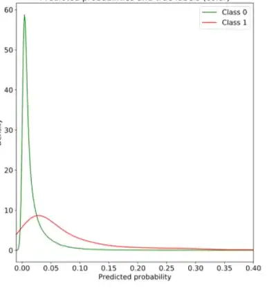
i have a classification problem where i am predicting likelihood of client defaulting on loan. i plotted the predicted probabilities from my model, and then plotted against the label '1' for default or 0 for non-default.
it is cut out here but y axis is the density. am i right to reason that this shows an exponential distribution, or that the fact the class 1 curve has a fat tail it shows that default is an extreme / unexpected event? woud you say class 1 is following any type of distribution?
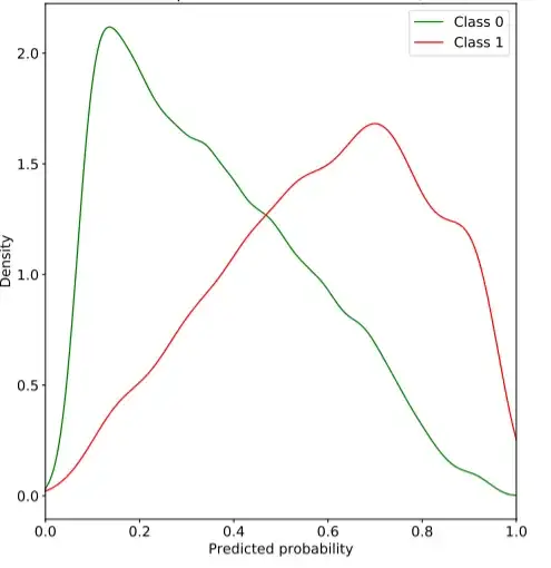
compare this to the below:
doesn't the second graph show that the model isn't that good at distinguishing between class 0 and class 1?

