1

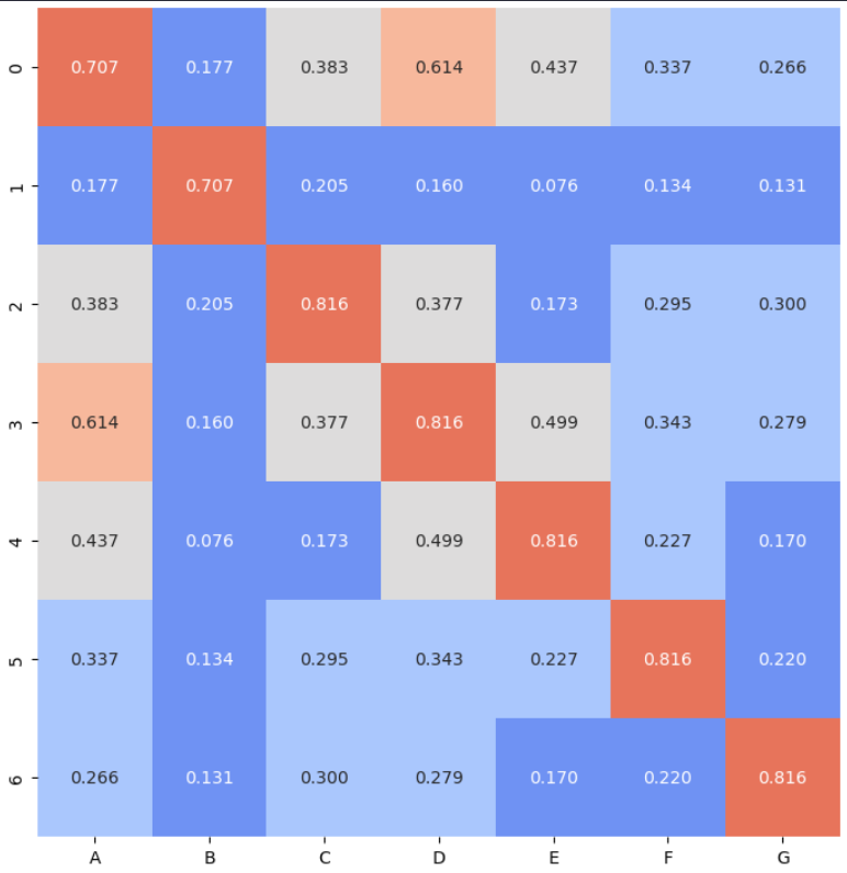
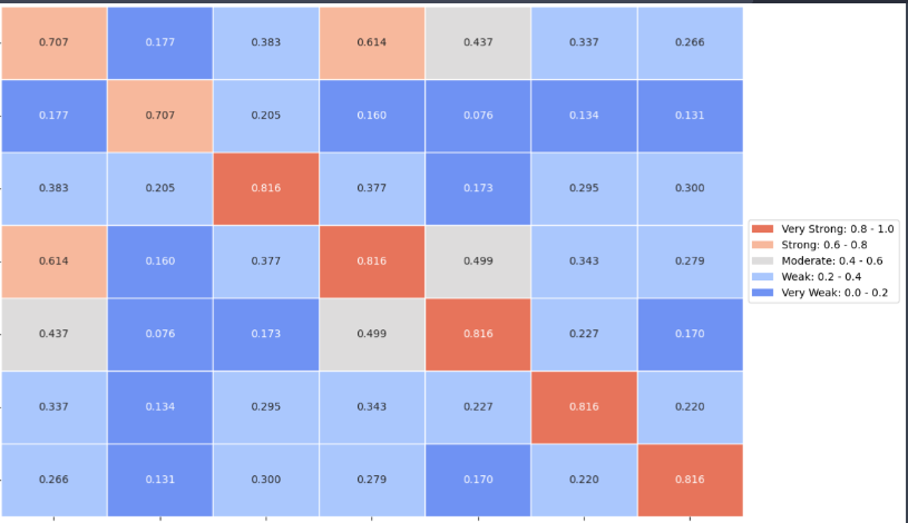
For the following dataframe of a chi2 correlation study, i started to plot a heatmap:

import pandas as pd
import numpy as np

columns = ['A', 'B', 'C', 'D', 'E', 'F', 'G']

results = np.array([[0.70709269, 0.17683162, 0.38328705, 0.61449242, 0.43709035, 0.33675627, 0.2661715 ], [0.17683162, 0.70709268, 0.20520211, 0.16044232, 0.07607822, 0.13364355, 0.13093324], [0.38328705, 0.20520211, 0.81649658, 0.37683897, 0.17308779, 0.29541159, 0.29975079], [0.61449242, 0.16044232, 0.37683897, 0.81649658, 0.4991043 , 0.34257853, 0.2786975 ], [0.43709035, 0.07607822, 0.17308779, 0.4991043 , 0.81649658, 0.22700152, 0.17041603], [0.33675627, 0.13364355, 0.29541159, 0.34257853, 0.22700152, 0.81649658, 0.22018705], [0.2661715 , 0.13093324, 0.29975079, 0.2786975 , 0.17041603, 0.22018705, 0.81649658]])

df_matrix = pd.DataFrame(results, columns=columns) category_bounds = [0, 0.2, 0.4, 0.6, 0.8, 1.0] categories = ['Very Weak', 'Weak', 'Moderate', 'Strong', 'Very Strong']

df_heatmap = pd.DataFrame(df_matrix, index=df_matrix.index, columns=df_matrix.columns)

colors = sns.color_palette('coolwarm', len(categories)) cmap = ListedColormap(colors)

fig, ax = plt.subplots(figsize=(10, 8))

sns.heatmap(df_heatmap, annot=True, cmap=cmap, fmt=".3f", cbar=False, ax=ax, linecolor='white')

plt.subplots_adjust(left=0.25, top=0.95)

plt.show()

But, for some reason (I suppose it is due to rounding the values), 0.71 and 0.82 are plotting in the same color. Can someone give me some guidance on what the problem is?

enter image description here

Pluviophile
  • 4,203
  • 14
  • 32
  • 56

3 Answers3

0

The issue you're facing with the heatmap is likely due to the limited number of colors in the coolwarm colormap. Since you have five categories ('Very Weak', 'Weak', 'Moderate', 'Strong', 'Very Strong'), you need five distinct colors in the colormap to represent each category uniquely.

One way to fix this issue is to use a different colormap that has enough distinct colors to represent all your categories. You can use viridis or plasma colormap, which are perceptually uniform and have enough colors for your categories.

import pandas as pd
import numpy as np
import seaborn as sns
import matplotlib.pyplot as plt

df_matrix = pd.DataFrame(results, columns=columns) category_bounds = [0, 0.2, 0.4, 0.6, 0.8, 1.0] categories = ['Very Weak', 'Weak', 'Moderate', 'Strong', 'Very Strong']

df_heatmap = pd.DataFrame(df_matrix, index=df_matrix.index, columns=df_matrix.columns)

Using 'viridis' colormap

cmap = 'viridis'

fig, ax = plt.subplots(figsize=(10, 8))

sns.heatmap(df_heatmap, annot=True, cmap=cmap, fmt=".3f", cbar=False, ax=ax, linecolor='white')

plt.subplots_adjust(left=0.25, top=0.95) plt.show()

enter image description here

Pluviophile
  • 4,203
  • 14
  • 32
  • 56
0

Setting the vmin and the vmax will make sure that the bounds of the values are spaced evenly by 0.2 with the 5 categories specified.

cmap = sns.color_palette('mako', len(categories), as_cmap=True)

fig, ax = plt.subplots(figsize=(10, 8))

sns.heatmap(df_heatmap, annot=True, cmap=cmap, fmt=".3f", cbar=False, ax=ax, linecolor='white', vmin=0, vmax=1)

enter image description here

yuckyh
  • 1
  • 3
0

The problem, as @yuckyh said, was that seaborn normalizes the variables to produce the colors. To avoid that, setting vmin and vmax was necessary:

colors = sns.color_palette('coolwarm', len(categories))
cmap = ListedColormap(colors)

Adjust the figure size to avoid overlapping y-axis labels

fig, ax = plt.subplots(figsize=(10, 8))

Plot the heatmap

sns.heatmap(df_matrix, cmap=cmap, fmt=".3f", cbar=False, ax=ax, linecolor='white', vmin=0, vmax=1, annot = True)

Adjust the position of the lines indicating the edges of the rectangles

ax.hlines(np.arange(n_variables+1), ax.get_xlim(), color='white', linewidth=1) ax.vlines(np.arange(n_variables+1), ax.get_ylim(), color='white', linewidth=1)

ax.set_xticks(np.arange(df_matrix.shape[1]) + 0.5, minor=False) ax.set_yticks(np.arange(df_matrix.shape[0]) + 0.5, minor=False)

Configure the tick labels

ax.set_xticklabels(df_heatmap.columns, rotation=45, ha="right") ax.set_yticklabels(df_heatmap.index, rotation=0)

Create a custom legend

legend_labels = [f'{category}: {category_bounds[i]:.1f} - {category_bounds[i+1]:.1f}' for i, category in enumerate(categories)] legend_elements = [plt.Rectangle((0, 0), 1, 1, fc=colors[i]) for i in range(len(categories))]

Reverse the order of the legend elements and labels

legend_elements = legend_elements[::-1] legend_labels = legend_labels[::-1]

Add the legend

ax.legend(handles=legend_elements, labels=legend_labels, loc='center left', bbox_to_anchor=(1, 0.5))

Adjust the spacing to avoid overlapping y-axis labels

plt.subplots_adjust(left=0.25, top=0.95)

plt.show()

enter image description here