Simulate some data:
library(ggplot2)
library(purrr)
library(ggthemes)

days <- seq(as.Date("2015-08-01"), as.Date("2015-08-31"), by="1 day")
hours <- sprintf("%02d", 0:23)

map_df(days, function(x) {
  map_df(hours, function(y) {
    data.frame(day=x, hour=y, val=sample(2500, 1), stringsAsFactors=FALSE)
  })
}) -> df
Check it:
ggplot(df, aes(x=hour, y=val, group=day)) +
  geom_line() +
  facet_wrap(~day) +
  theme_tufte(base_family="Helvetica") +
  labs(x=NULL, y=NULL)
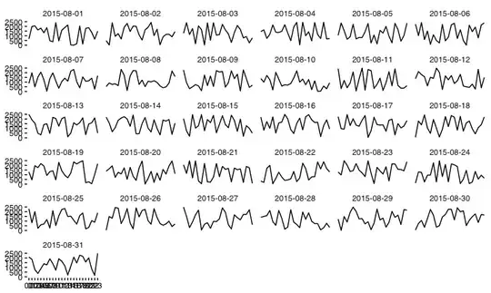
Since you're only trying to convey the scope of the variation, perhaps use a boxplot of the values of hours across days?
ggplot(df, aes(x=hour, y=val)) +
  geom_boxplot(fill="#2b2b2b", alpha=0.25, width=0.75, size=0.25) +
  scale_x_discrete(expand=c(0,0)) +
  scale_y_continuous(expand=c(0,0)) +
  coord_flip() +
  theme_tufte(base_family="Helvetica") +
  theme(axis.ticks=element_blank()) +
  labs(x=NULL, y=NULL)
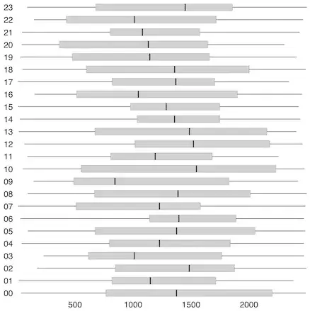
That can be tweaked to fit into most publication graphics slots and the boxplot shows just how varied each day's readings are.
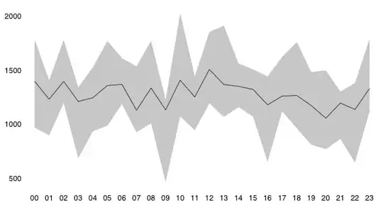
You could also use boxplot.stats to get the summary data and plot it on a line chart:
library(dplyr)
library(tidyr)

bps <- function(x) {
  cnf <- boxplot.stats(x)$conf
  data.frame(as.list(set_names(cnf, c("lwr", "upr"))), mean=mean(x))
}

group_by(df, hour) %>%
  do(bps(.$val)) %>%
  ggplot(aes(x=hour, y=mean, ymin=lwr, ymax=upr, group=1)) +
  geom_ribbon(fill="#2b2b2b", alpha=0.25) +
  geom_line(size=0.25) +
  theme_tufte(base_family="Helvetica") +
  theme(axis.ticks=element_blank()) +
  labs(x=NULL, y=NULL)