I'm plotting a dataset with a trendline, but using ols vs lowess gives me significantly different line shapes. I'm sure this is an expected and perfectly normal result, but I'm afraid I don't understand the significance of the difference. Could someone explain what's going on?
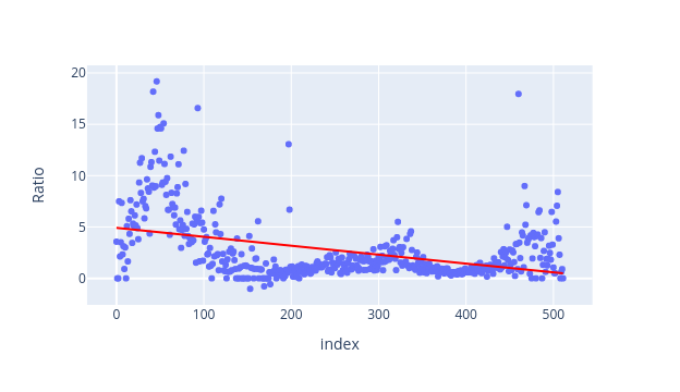
Here's my code using ols:
fig = px.scatter(df_small, y="Ratio",
                 trendline="ols",
                 trendline_color_override="red")
fig.show()
And here's the plot it produced:
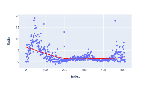
Using lowess gave me this plot:
 For context, my dataset represents the ratio of daily Covid deaths:new infections in the Province of Ontario over the previous 18 months.